Sunday, November 15, 2009

Lillian Bassman

Expanding on the idea presented in my last post, Autochromes, I’d like to dig deeper into the relationship between technology and art. My photography career began in a commercial photo lab in the pre digital days of toxic chemicals and long hours manipulating beams of light in darkened rooms.

The great advantage of having worked in this environment is that I got on the job training for all the technical possibilities different film stocks and chemical baths provided. One of the most interesting of the many Kodak films I encountered was Kodalith Ortho. This was an extremely high contrast black and white film that has wide exposure latitude. Not sold as a commercial film, it was designed for graphic arts applications. I soon discovered that I could take my original continuous tone black and white negatives and dupe them onto Kodalith stock creating a very contrasty effect where the mid-tones virtually disappeared.


At the same moment I was learning about Kodalith I became aware of a fashion photographer, Lillian Bassman, whose work closely echoed the effect of that film’s visual possibilities. Lillian established her reputation as a staff photographer for Harper’s Bazaar from 1949 through 1965. Under the tutelage of famed Art Director Alexey Brodovitch, her intimate, sensual black and white photographs stood toe to toe with the male fashion giants of the day – Richard Avedon, Irving Penn, Horst P. Host, and Cecil Beaton.


Employing a chiaroscuro effect her images of women balanced powerful lines and elegant composition. Her darkroom techniques included chemical bleaching and blurring to create an ethereal, watercolor like feel to her prints. Her images, while impeccably composed,  were subtly different from her male counterparts of the day. Her subjects were often posed in profile or looking away from the camera, offering a more romantic, less overtly sexual countenance.


Lillian Bassman lived an unconventional life. She was born in Brooklyn, NY, in 1917 to bohemian Russian Jewish immigrants. During The Great Depression she modeled for artists at the Arts Students League as part of the WPA program and participated in many political strikes, once picketing in the nude to protest arts financing cuts. She attended school at the Textile High School in Manhattan and took evening classes at Pratt institute. In 1945 Lillian became Art Director for Junior Bazaar magazine where she established a working relationship with Richard Avedon, soon to become her friend and mentor.


In 1965 she abandoned her commercial fashion work to pursue personal projects. After many years away from the heated world of fashion editorial she was drawn back in when her downstairs neighbor, painter Helen Frankenthaler discovered garbage bags filled with Bassman's negatives in the backyard, abandoned for 20 years.


There is currently a tremendous renewal of interest in Lillian Bassman’s career. In 1996 she was hired by Neiman Marcus to shoot an advertising campaign. Now in her 90’s she still remains active, using Photoshop to fulfill her creative visions in a new age of digital reproduction. A book, Lillian Bassman Women has just been published and there is a concurrent exhibit at the Staley Wise Gallery in New York through Nov. 28th.


Her masterful darkroom techniques have enabled her to fulfill a rich photographic vision that still resonates today.

Wednesday, October 28, 2009

Autochromes

One of the wonders of photography is how it enables an interaction of art and science. A successful photographic vision must take both aspects into account. It’s fascinating to trace trends in photography and tie them to the techniques available at any particular time. Recent changes in digital imaging software often create a concurrent boom in style. For instance, a few years ago Photoshop CS2 introduced a built in High Dynamic Range function. Suddenly everyone was producing (or some might say, overproducing) images that represented luminance values unseen before in previous digital photographs. While this synergy between technology and creativity might seem commonplace in todays rapidly moving digital environment, the history of photography is laced with such interactions.


In 1907 the French Lumière brothers (known as one of the earliest cineasts and inventors of numerous motion film processing techniques) unveiled a new technology for producing color still photographs patented as Autochromes. The production involved grinding potatoes into microscopic grains and then dying these particles in batches of red-orange, violet and green. The potato starch was then thoroughly mixed and coated onto lacquered glass plates. The plates were pressed through rollers to flatten, effectively creating minute color filters.


The autochome method yielded soft, creamy, ethereal colors. The grain was very apparent and it’s coarse uneven quality created stray colors. Yet the inherent imperfection of the process was also its greatest strength, producing a dreamy, almost pointillist effect. As is often in the history of photography’s many permutations, the science determined the art.


Many serious photographers took up the autochrome process including Edward Steichen and Alfred Stieglitz.


Alvin Langdon, an up and coming photographer known for his portraits of Henry James, George Bernard Shaw, W. B. Yeats and Auguste Rodin also jumped into this new world of color photography. In 1908 he produced an iconic image of Mark Twain reclining in red dressing gown holding a pipe in one hand and a book in his other.


The glass plate autochrome process continued successfully until the 1930’s and then became supplanted by more contemporary film based technologies like Kodaks color reversal film, Kodachrome.


There has been a renewed interest in autochrome photography in recent years. The George Eastman House has a significant collection. Last year the Amon Carter museum in Fort Worth, Texas held a major show 100 Years of Autochrome. Currently UC Riverside has an exhibit Smoke and Mirrors The Magic of Autochrome through Jan. 2, 2010.


Links:
Amazon
Wikipedia


Friday, October 9, 2009

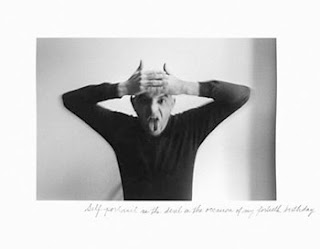
Duane Michals


Photography is often seen as having the ability to define truth by recording any particular reality in a fraction of a second. This notion has been popularized throughout photography’s history and can be encapsulated by the oft used phrase “capturing the moment.” While this might be important to photojournalists whose stock in trade is truthfulness, I prefer the divine lie which photography more often provides.


By divine lie I mean the ability to create fictions: ideas created in the imagination brought to light as two dimensional graphic stories we call photographs. In the 1960’s and 1970’s there was one photographer that took this idea of story telling to the pinnacle of fine art. His name is Duane Michals.


Michals was born in 1932 in McKeesport, PA to working class parents of Czech descent. His mother worked as a live-in maid for a wealthy family and only saw her family on weekends. Often alone as a child, he delved into his rich imagination, creating an interior world populated with alter egos to keep him company. After serving in the military he spent a year at Parsons School of Design and then began working with magazines as an art director and designer. In 1958, bored and yearning for some larger existence he took the opportunity to travel to Russia, newly opened to tourism. Michals borrowed a friends 35mm camera to use on the trip. Wandering the streets of Leningrad he began taking snapshots and portraits of the people he encountered. Upon his return home, he realized the ennui had not lifted and his life needed a new direction. Photography was his new course.


Michals demonstrated that photography didn’t have to be about a concrete reality. Instead he used the medium to explore philosophical and spiritual beliefs. He wanted to capture the mind’s interior thoughts and all its complex neuroses. He achieved these aims by using a cinematic technique of sequenced images to tell a story over time. He often employed his own hand written comments to elaborate the story, yielding a personal, memoir like effect. Death is a theme often visited in his sequences. He employs blurring as a technique to denote an evanescence of spirit and energy.


Much of Michals work is influenced by surrealism, demonstrated by an abundance of visual non-sequiturs. The surrealist painter René Magritte was both an influence and subject for his photographs.


Equally at ease with commercial and fine art work, he has shot for Vogue, Esquire and Mademoiselle magazines. In 1974 he covered the filming of Robert Redford and Mia Farrow in The Great Gatsby for Vogue magazine resulting in stunning, ethereal photographs of Farrow.


Michals has published numerous books including Sequences 1970, Real Dreams 1976 and more recently The Adventures of Constantine Cavafy, 2007. His work hangs in the permanent collection of the Museum of Modern Art.


“I believe in the invisible” – Duane Michals


Links:
Amazon
Wikipedia
PDN Legends

Sunday, September 27, 2009

Topolino


It's not a well disguised secret that the art of fashion photography is a collaborative endeavor. The final image is the result of a team of artists each contributing their expertise to what is hopefully a stunning, transformative photograph. The list of participants involved in any single image is long, including models, lighting assistants, set designers, fashion stylists, hair stylists and retouchers. In my estimation one of the most crucial artists of all is the makeup artist.

Each contribution is essential and must reach for perfection but none more so than the "maquillage".
Perhaps it's the human inclination to search the face first, before taking in any other visual information. When encountering a photograph I arrive at a multitude of aesthetic opinions at once but my eyes always lock on to the face, searching for clues to emotional communication. Delight, wonder, joy, sensuality, loneliness, fear are all communicated by the most imperceptible contraction of the eye or mouth and enhanced by the splendor of the makeup artist's work.

While there are a plenitude of talented makeup artists working today, none stand above "the little mouse" Topolino. Arriving in Paris at 19 years old from his native Marseille during the creative explosion of fashion photography in the mid 1990's, he quickly climbed the daunting fashion heights, working for magazines like The Face, Arena, Interview, I-D, and Vogue. His photographer collaborators include Jean-Baptiste Mondino, Jean-Paul Goude, Mario Testino, Pierre et Gilles, Bettina Rheims, Thierry Le Goues, Raymond Meier and on and on.

 
A genius with accessories, he can manipulate human physiognomy  to create fantastical transformations that go beyond mere beauty and tap into  a mixture of mythology and cartoon pop culture. Butterflies, feathers and beads of glass are just some of the items in his kit to aid his flights of fancy. He practically defined a style of makeup that is copied to this day.

 
Topolino is still in top demand for his makeup skills. In 1995 he was honored with a show at the Musée de la Mode. His book Make-Up Games was published by Assouline in 2002.


Links:
Amazon

Thursday, September 17, 2009

John Hinde (1916-1998)

Consider the lowly postcard.  So simple, yet able to achieve a complexity of functions all at once. An inexpensive means of correspondence used to communicate a message both written and visual. The postcard also serves to promote a business, vacation spot or perhaps even a piece of art.

In the late 80’s I used to frequent an establishment called Quantity Postcards in North Beach, San Francisco. A large open space with two facing walls covered from floor to ceiling with racks of Postcards. Every type of imaginable image was represented – scenics, portraits, illustrations, sports, paintings; all of human activity condensed to 3 x 5 bits of cardboard. It was a glorious visual overload.

Unable to afford costly hard bound catalogs of the painters whose work I admired so fiercely I instead collected their postcard reproductions. When I travelled to museums across the US or Europe I always made sure to visit the museum store before leaving to collect my souvenir postcards.


Which brings me to a rather obscure photographer (to Americans at least) that single-handedly conquered the Postcard trade in Ireland and the UK. John Hinde was perhaps an unintentional artist. His main objective was to create images for mass consumption. He created his own business, John Hinde Ltd. in 1956 to facilitate the printing and distribution of his photographs through books and postcards.

John Hinde was born in Somerset County, England to an Irish national mother and was raised as a quaker. Pursuing amateur photography at an early age by 1940 Hinde had conquered the difficult tri-color carbo printing process developed by Paul Outerbridge. He fervently believed in craftsmanship and insisted on the  finest color reproduction possible. Throughout the decade he worked on several books including some on horticulture where he struggled to match his meticulous color prints to the means of mechanical reproduction available for mass market books at that time.


During the war he utilized his passion for photography making pictures for the British Civil Defence Organization. This work was later published in a book entitled Citizens at War - and After 1945.


By wars end Hinde was ready for new endeavors. In 1944 he photographed a circus to make pictures for his book British Circus Life. The circus bug had bitten and for the next ten years he participated in his own circus life, first as a manager and then owning his own circus troupe until 1955. It was during this period while traveling with this troupe that he first experienced Ireland. He made several scenic photographs depicting the wild, natural beauty of the Emerald Isle. Opportunity had struck again. He began his postcard business, catering to the tourist trade, illuminating the allure of his adopted new home.


Prior to World War Two color photography was still a difficult process, both costly and labor intensive. It was not easily accessible to the amateur photographer. But by the wars end color photography’s moment had truly arrived. Inexpensive color film stock had finally arrived on the market. The stark, black & white, blitzed and bombed British Isles were primed for a new era of optimism and freedom best represented by vibrant, exciting colors.

Hinde was famously quoted as saying “the lily has to be gilded”. He felt that the scenics must adhere to his rigorous definition of photographic composition. He had no problem rearranging his landscapes by adding plants or tree limbs to the foreground  or perhaps wiring stalks to force their shapes into a pleasant symmetry. He wasn’t so much recording nature but reinterpreting it to match the tourist’s heightened memories.


In the late sixties Hinde began working with Butlin Holiday Camps producing postcards advertising these low-cost working class vacation camps dotted throughout the UK. At this point he relinquished much of the actual shooting to a group of hired photographers and supervised the reproduction of the images still holding to his aesthetics of bold, vivid colors.


In 1972 Hinde sold his business and retired to a life of landscape painting. While he never had much regard for his own photographs as “art” he nonetheless was honored with a retrospective show in Dublin’s Irish Museum of Modern Art in 1993.

I leave you with one final quote from John Hinde – “I had this sort of vision thing, of the top of the ladder when I was at the bottom, of fantastic colour photographs that I had never seen and that nobody else had ever seen and my whole aim was all the time how to get there, how to achieve it. You ever visualize Heaven?”


Links
Amazon
Wikipedia  

Saturday, September 5, 2009

Erwin Blumenfeld (1897-1969)


I’ve spent my entire life on the prowl in used book stores. Hungry for all those endless words and magical pictures. I was certain that someday they would all stack up to a transcendent meaning. It was both an act of faith and a decadent pleasure. Every trip up and down the musty aisles provided me with new vistas into my imagination. 


It was during one such journey through the remainder photography section that I came across a stark image on an oversize soft-cover book entitled The Art Of Vogue Photographic Covers: Fifty Years Of Fashion And Design.


The powerful, startlingly simple cover depicted a face erased; with only a beautifully colored eye, a perfect arched eyebrow, pouting ruby lips and a black mole like a punctuation mark. The disembodied elements floated on the cover in perfect balance. I had to know more about the photographer who created this 1950 cover for Vogue magazine.


It turns out that Erwin Blumenfeld, the creator of this iconic image had a legendary career that began in his Amsterdam leather goods shop in 1932 with photo collages depicting the heinous evil of Hitler and Nazism. Born in Berlin to a Jewish family he emigrated to Amsterdam after serving as an ambulance driver in World War One. He participated in the Dada movement as a painter and writer and had befriended George Grosz and John Heartfield, also renown for his photomontages mocking Hitler.


In the late thirties he moved to Paris and circulated with the Surrealist artist’s of the day including Man Ray. He began shooting for many magazines including French Vogue and Votre Beauté. At the start of World War Two he was interned in a French concentration camp. After his release he moved to New York and began to shoot for Harper’s Bazaar.


Experimentation with darkroom techniques was key to Blumenfeld’s oeuvre. He utilized solarization and  superimposed images to remove the subject of his photographs from any object reality. He often utilized mirrors to refract and reflect light which amplified the subject, creating repeating patterns. Deconstructed in the manner of the cubists, shards now stand in for the whole, fragmenting reality. The psychology of the image becomes the photograph's intent.

His masterful use of color was a key ingredient to his success as a fashion and fine art photographer. He often employed a subtle tone on tone choice of color that could focus the viewer on the photograph's geometry.


His constant experimentation with color and form has influenced a generation of contemporary fashion photographers including Paolo Roversi, Javier Valhonrat and Nick Knight.


Links: